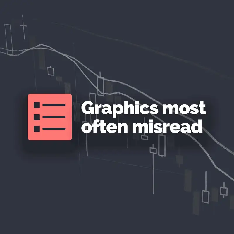
Top 5 types of graphics most often misread
Mark gets political and data-visual with data visualisation expert, Alberto Cairo.
Alberto has a journalism degree and worked as a graphic designer for many years. He now teaches the subject, and quite literally wrote the book on it. Although a lot of what’s covered in this episode is US-centric, Alberto maintains that the misuse of graphics isn’t a partisan problem linked to whether someone’s in a blue state or a red state, but essentially that the right is guilty of bullshitting.
Bullshit is a word you’ll hear a lot in this episode, and especially refreshing in a Spanish accent. But in this context, it has a very specific meaning, with its roots in a book by Harry Frankfurt.
In Alberto’s latest book, How Charts Lie, he reminds us that “a chart shows only what it shows”, and nothing else.
- (00:00) - Introduction
- (09:34) - Alberto's pick: Choropleth map
- (14:02) - Mark's pick: Omitting the baseline
- (17:46) - Alberto's pick: Manipulation of line charts
- (21:02) - Mark's pick: Distorting the X axis
- (24:12) - Alberto's pick: Perspective effects
- (26:14) - Mark's pick: Real-world objects as bars in a graph
- (29:14) - Alberto's pick: Projection
- (34:06) - Surveys
- (38:30) - Alberto's pick: Sourcing of data
- (43:46) - Mark's pick: Reversing the Y axis
- (46:58) - A break along the axis of time
- (48:16) - Building the final list
- (51:08) - How Charts Lie
- (56:08) - Goodbyes
In the discussion around Mark’s fourth pick — about 38 minutes in — Mark and Alberto discuss how the question of abortion is tackled within the US, in order to bias survey answers. They don’t get into the actual topic of abortion, but some of the language around it is a little bald.
Mark mentioned a move by the Lib Dems in 2019 that raised a few hackles online, which was covered in the Guardian.
Creators and Guests
Host
Mark Steadman
My mum thinks I’m an internet thought leader. I haven’t had the heart to tell her I just have a microphone and some good intentions.
Guest
Alberto Cairo
Designer, journalist, and professor. Author of The Art of Insight (2023), How Charts Lie (2019), The Truthful Art (2016), and The Functional Art (2012).